Tips for deck-making
I like to joke that I’m a professional slide-deck maker. I’m not really joking.
In my not-even-ten-year career, I’ve made easily hundreds of slide decks. (Definitely not thousands yet, that would be over two decks per week minimum.) I’ve often made the same slide deck multiple times, either refreshed for the new year or redrafted before the first review.
I have clear memories of some of my finest decks as well:
- The strategy and hero-feature decks used from 2021 - 2023. This had great context-setting.
- The personal finance for new grads deck used in 2018+. This had great storytelling.
- The deck on PM’ing for prospective PMs used in 2022. This had great visual arrangements.
- The deck used to make a particular product decision related to image aspect ratios. This had great data visualizations.
- The deck I made about go/no-go reviews to advise new PMs on the team. This had great slide-within-a-slide format.
- The deck I made to make a particular product decision related to Google Lens Suggestions. This did well at putting data in context.
I love all these decks because I continue to refer to nearly all of them even years later. But Let’s see how many of those I remember when I re-read this in a decade! If only they weren’t all confidential. I’ll miss my finest deck templates.
A manager asked me once to make a “vision deck”. I tried several times, and every time I got feedback that basically said: we’re not converging on a good deck. When I say several, I mean 10+. Every time I got a new round of feedback, I’d nearly rewrite the deck. It became a sort of “make a good deck or die trying” sort of project. I swore if I only did one good thing that year, it’d be a deck my manager actually liked. It probably took me 2 years.
Anyway, I eventually got so fed up I took a deck he’d made recently, studied it for hours, and took notes on every nuance and strategy I observed. When I finally just did that, he was finally happier, and I learned some very important techniques for making great decks.
So here are my rules! Or … are they my former manager’s? We’ll never know.
Tips
Pretty decks are better than ugly decks, but that’s all
You will make some ugly decks as a new deck-maker or new PM, especially if you come from an engineering-driven background. Making them pretty is a good first step, but it mostly just wraps bad content in a veneer of professionalism. I’ve seen plenty of great-looking dumb ideas from particular PMs or teams.
My advice – find a deck template you like and just borrow its slides, touching formatting minimally. Or ask your UX designer to take a pass over your deck. That latest deck is now your NEW slide template, so just borrow its slides for the next one, and so on.
Pretty soon all your decks will be pretty and you’ll spend the overwhelming majority of the time communicating clearly rather than formatting beautifully.
Your slide titles should read like a paragraph
This is hands-down my best tip. When you read JUST the titles of your slides out loud, in order, it should read like it belongs in a doc as a single paragraph. You should be able to use a nice, large, bold title font without the title wrapping to a second line, either.
There are some great benefits of this technique.
(1) Every slide will have title that documents the takeaway. It’s very easy to communicate a bunch of information in a slide but no conclusion by accident. This way, you’ll never make that mistake.
(2) You will end up with exactly one takeaway per slide, which is a tip called “billboarding”. Since you have to cram your takeaway into a single line, you need to get focused. You can’t have an “and” or “or” or “because”. Every other clause in that sentence gets moved to a new slide. This also means you have less information to cram into each slide, because you only have to justify a narrower takeaway.
(3) Your deck will be useful offline, not just in-person. When people can trivially read the titles and takeaways, they don’t need your voiceover. The titles tell the story!
(4) I gave it away just now, but your deck will tell a story. It will flow from slide to slide naturally, have an obvious perspective and conclusion and claims, and progress from point A to point B. People will walk out not just informed, but also having processed that information and put it in context – you will their thinking forward.
(5) Outlining will be trivial: you can outline the deck and rearrange, add, and delete slides just based on titles, before you ever fill in the content. You can even move slides after filling in the content just by tweaking the title to make it fit into the slides before and after it and not touching content at all. I’ve never been one to outline docs, but with this tip, I outline decks all the time.
I simply can’t recommend this tip enough! It’s easily worth more than all the rest combined.
Translate raw numbers to comparables
Nothing screams “bad presentation” than a data-dump slide with a table of data with tiny fonts to fit it all in, a random contrast color applied to some pieces of text, and … I could go on.
You should always present numbers in context. Context means relative to a reference. Your reference is perhaps last generation’s product, or your competitive product, or simply “option 1”. Everything else is relative to that: +150% sensitivity, -$1.43 per unit, 33% higher resolution, and so on. When you’re aiming for a budget, give the cost above or below budget. When two numbers are the same, don’t repeat the number. Use a symbol that means it’s the same. And so on!
And if you must use colors in your data …
You get a few neutrals, a contrast color, and stoplights
Color is the component of making something pretty that also communicates – or confuses – the conclusion and information. Your goal is to use color in a way that enhances. Luckily, it’s pretty simple.
You should avoid black and white. Stick with a neutral off-white base (I’ve seen yellow-ish, green-ish, purple-ish, gray-ish) and very-dark gray text (almost indistinguishable from black). This maintains contrast for readability but softens the harsh black-vs.-white and shows you did something to improve on the default templates.
Even if your company’s colors are red-yellow-green (grumble) and company-themed templates are super-cute, you shouldn’t use those colors for anything other than “stoplight” colors. Red is always “bad”, yellow is always “not great, not terrible”, and green is always “good”. Never, ever, ever break this rule.
Pick one contrast color. I often use blue or pink, but orange can wokr. Use it for asides, labels, circles / arrows, textboxes outside the main content. If you have a sub-phrase to highlight in a larger body of text, use a dark version of your contrast color for the text and a very-light version for the highlight (this, again, maintains readability).
Your UXer can help you select a color palette. I find blue contrast works well with off-white bakground, dark purple plays well with light purple, yellow plays well with dark purple … But I am no UXer.
Just 10 slide templates will cover 90% of your needs
I said above, once you’ve made your first deck and had your UXer take a pass over it, you’ve got your slide template now. You can copy-paste slides from that into your next deck and only make new slide types as needed. And you’ll mostly find there are just a handful of templates you can stretch to the overwhelming majority of your needs.
This is great – again, you can spend all your time focusing on the quality and clarity of the content, not how it all fits into the slide and looks pretty.
Because I’m a nice person, I’ll even post some images of the slide templates I use again and again.
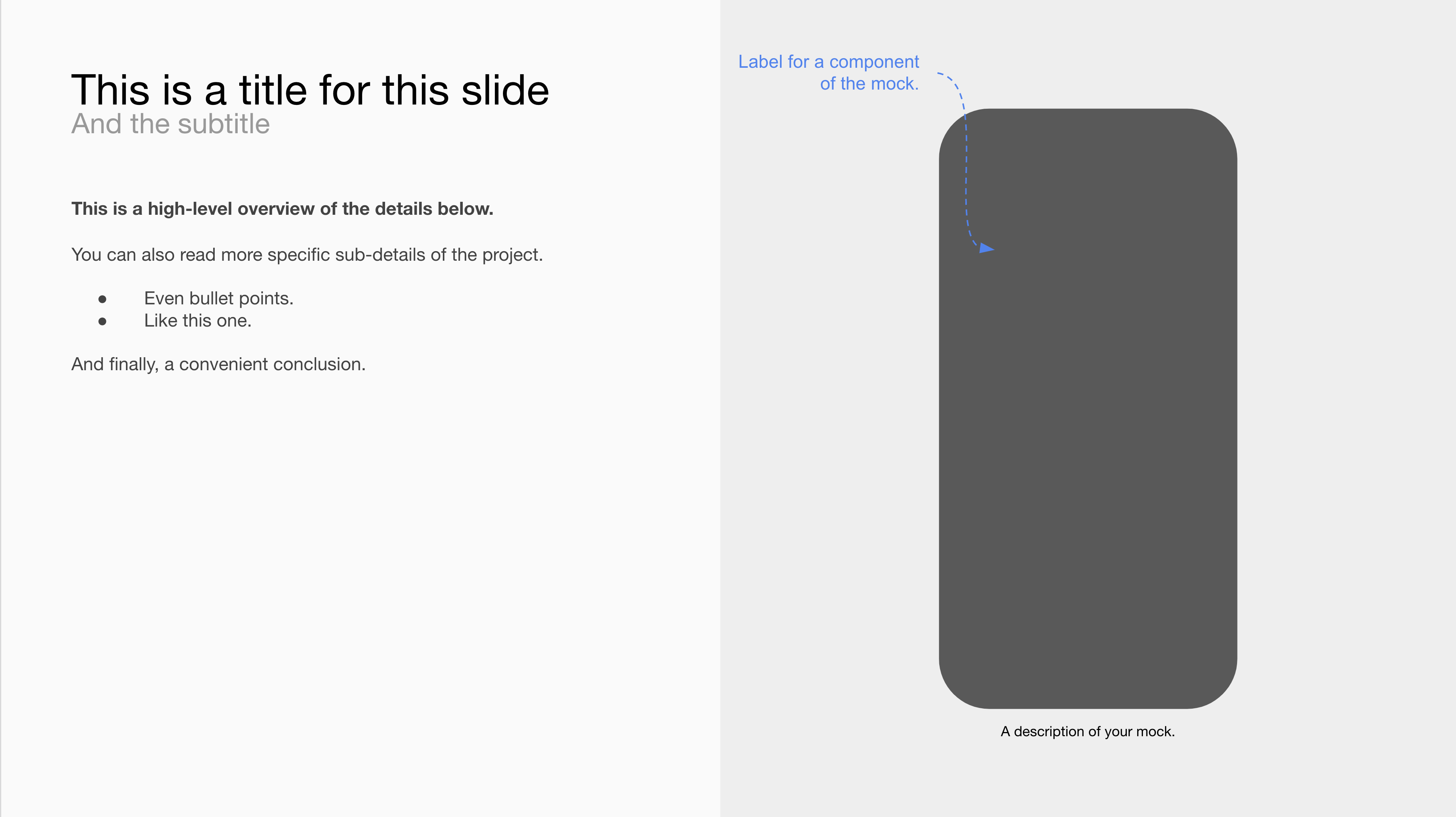
I use this one for showing individual features, UXes, sub-decisions. Sometimes on the right is a mock, sometimes it’s technical requirements, sometimes it’s “asks”. But generally it’s a left-right layout focused on multiple representations of one “thing”.

Nice wrap-up slide.
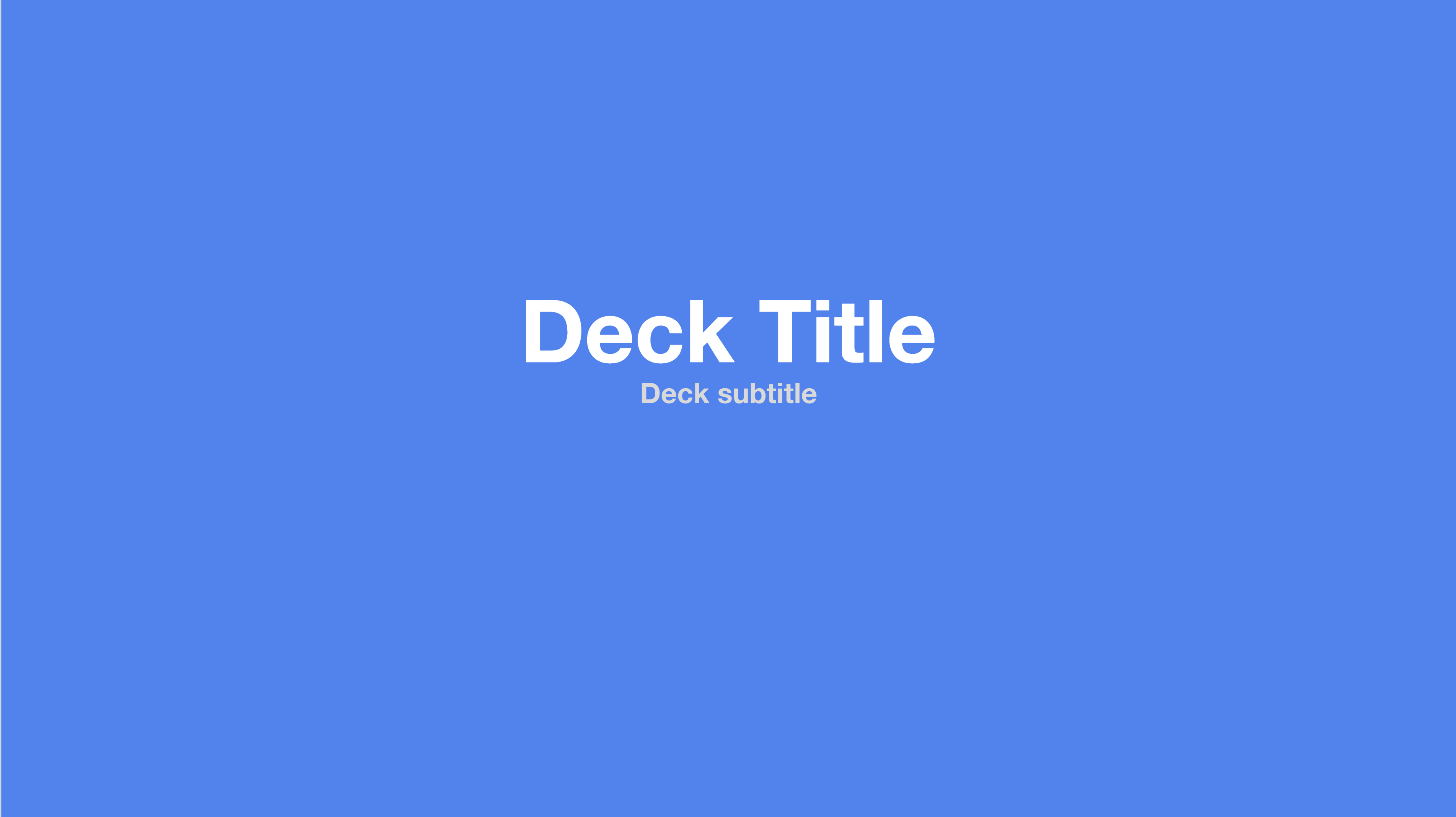
Nice title slide to kick off the deck.

Easy section header.
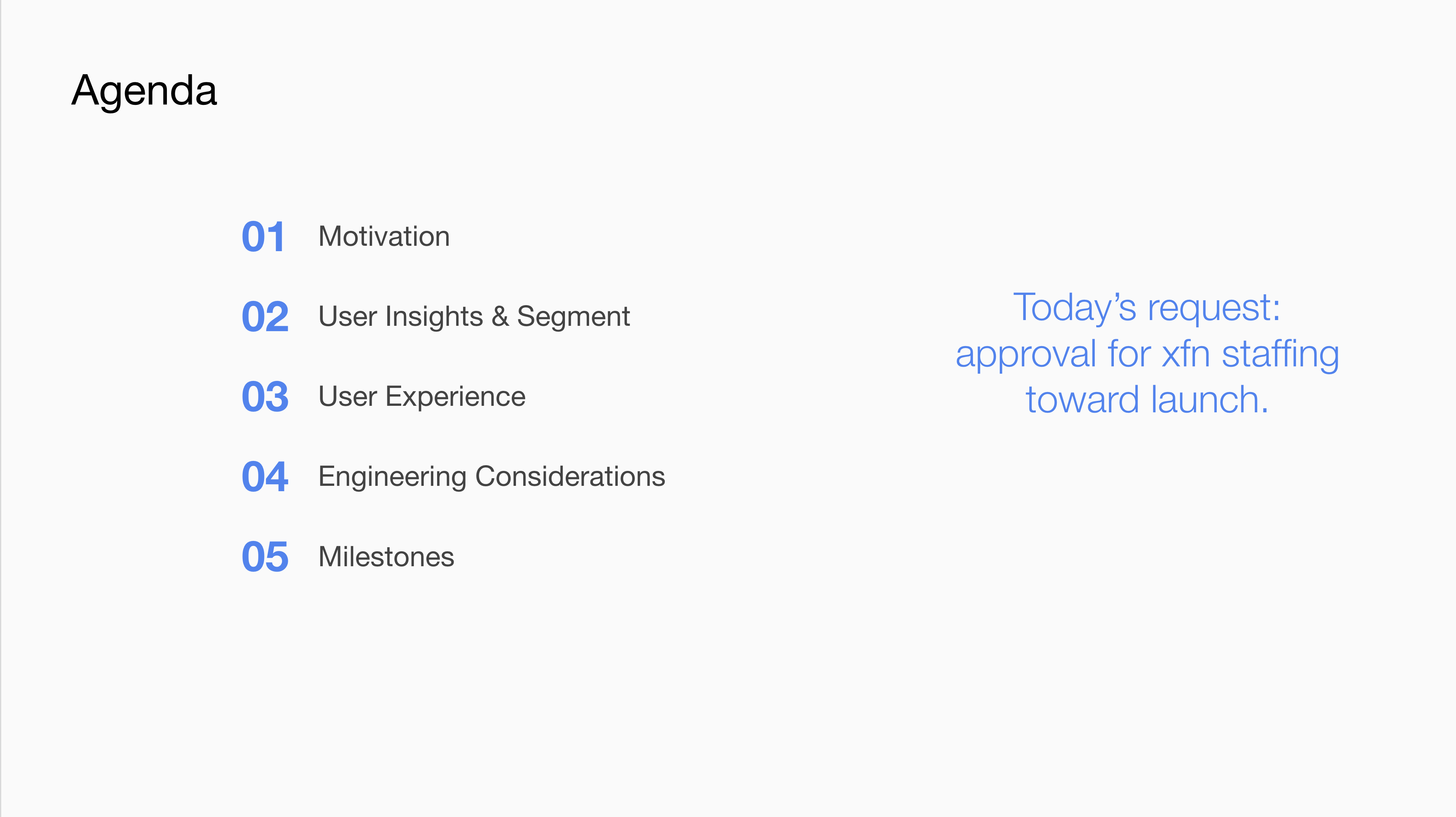
Convenient agenda slide. Note execs get to know why we’re here, too.
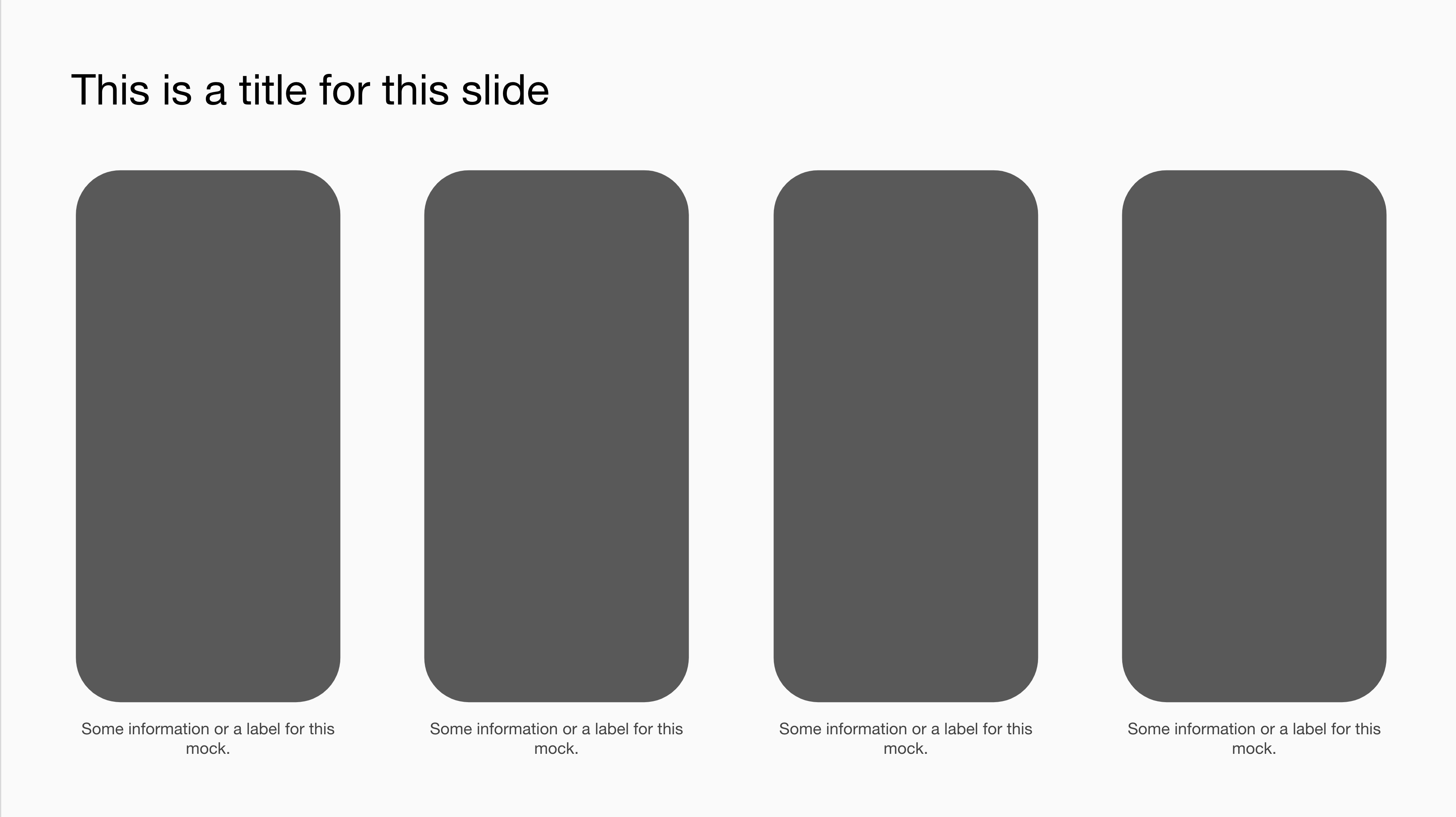
This is a slick one for adding multiple mocks so you can see an entire flow through multiple screens or compare multiple options (or competitors).
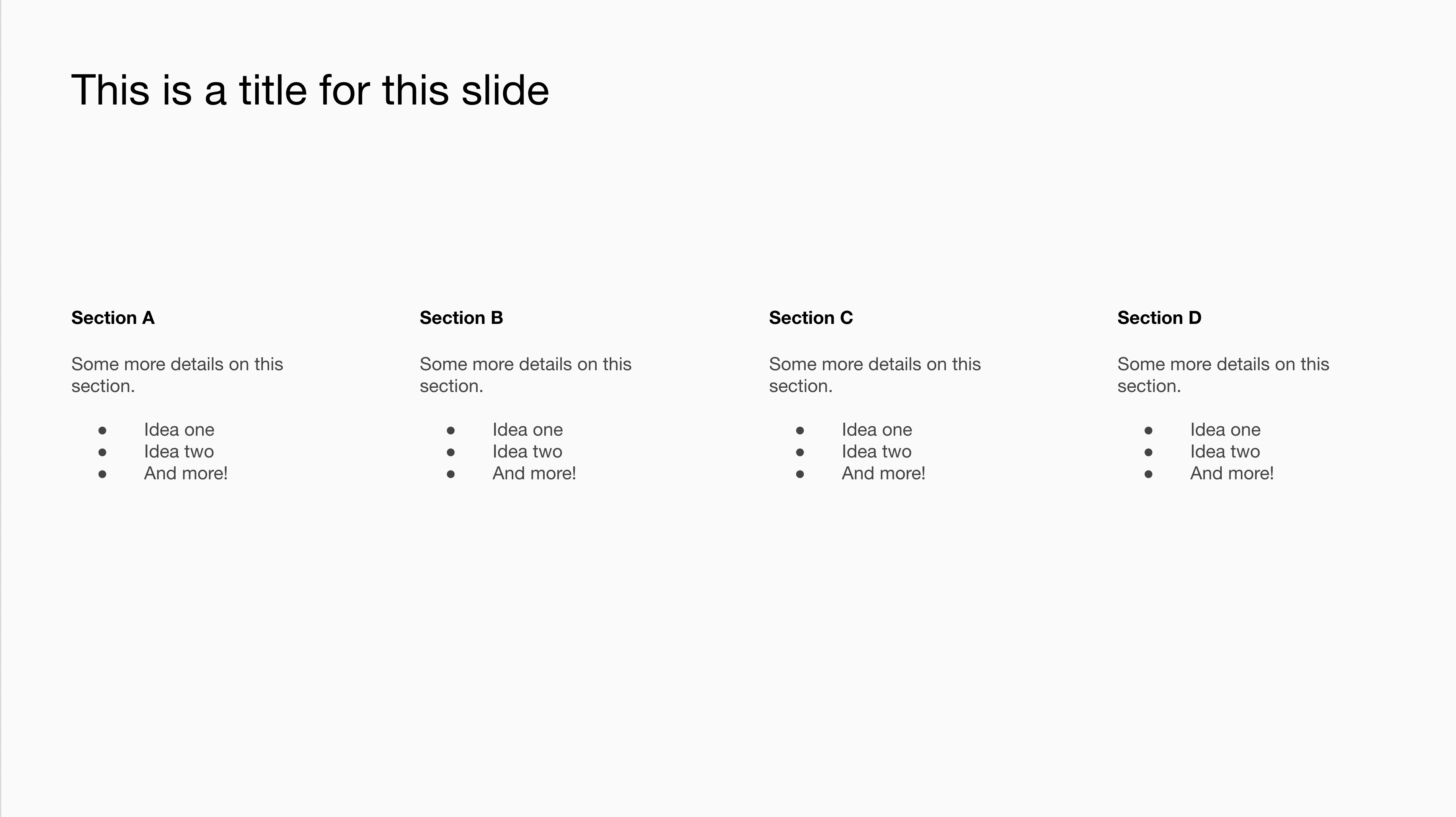
I get a surprising amount of mileage out of this one too, such as for roadmaps, themes and features, or comparisons – but text-forward ones rather than image-forward.
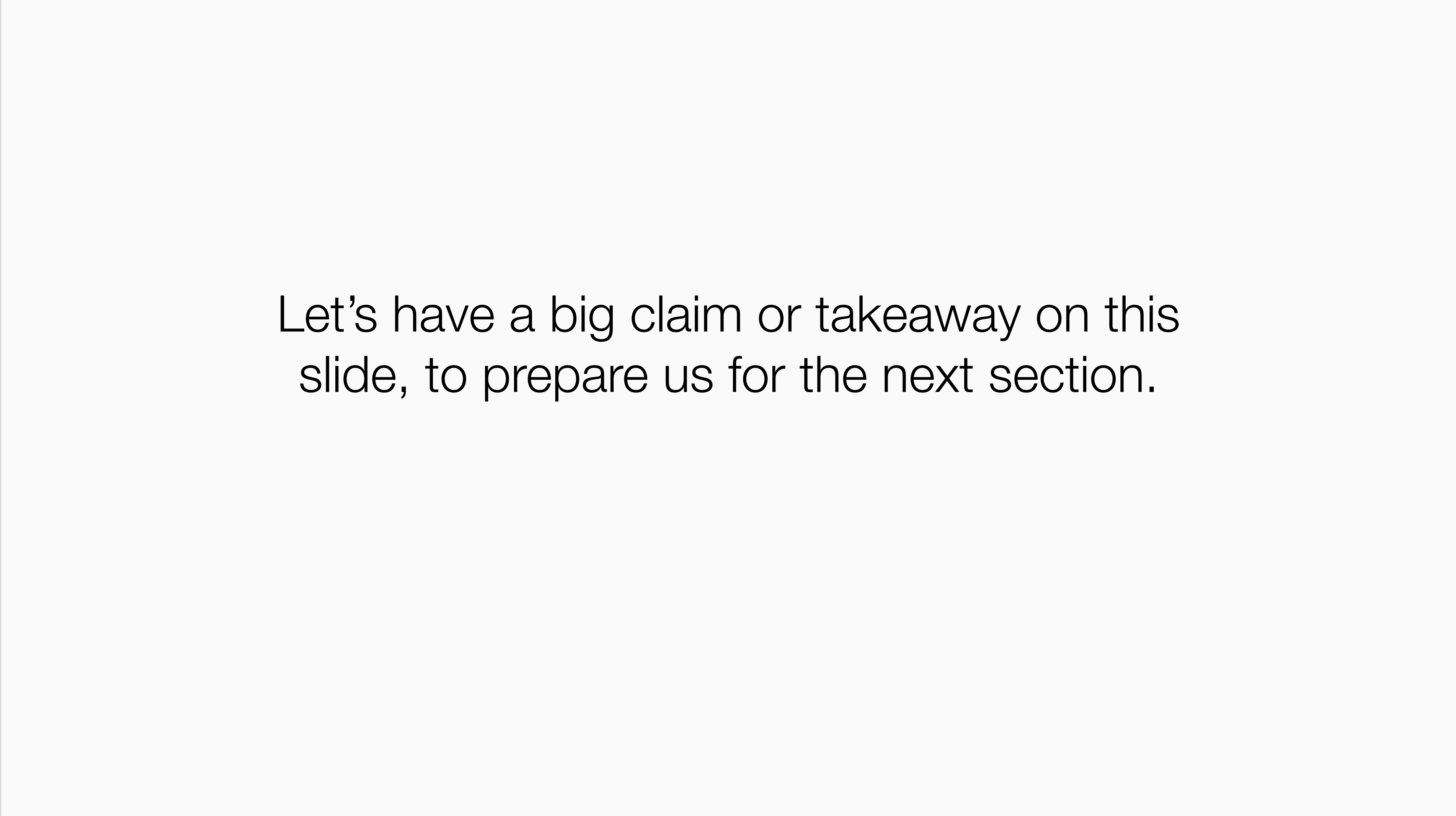
I use this one a ton, too. It’s a claim that introduces the next several slides or sums up the previous ones. You could call it an improved section header – almost.
You need to communicate the WHY of the deck, not just the WHAT
The deck is a tool to achieve a goal – a discussion, decision, alignment, inform, etc. It’s only the tool to that goal. Your audience needs to know what goal you’re aiming for so they can put your information in context. In general that means labeling your section headers clearly – oftentimes with questions the section seeks to answer, rather than a category for the content in that section. And it always, always means leading with a slide or two that discusses what you want from this meeting and this audience. The deck is a product, basically!
Conclusion
Anyway, that’s all I’ve got. Should’ve put this in slide deck form!